Responsive Web Design: A Must for Businesses
Understanding Responsive Web Design
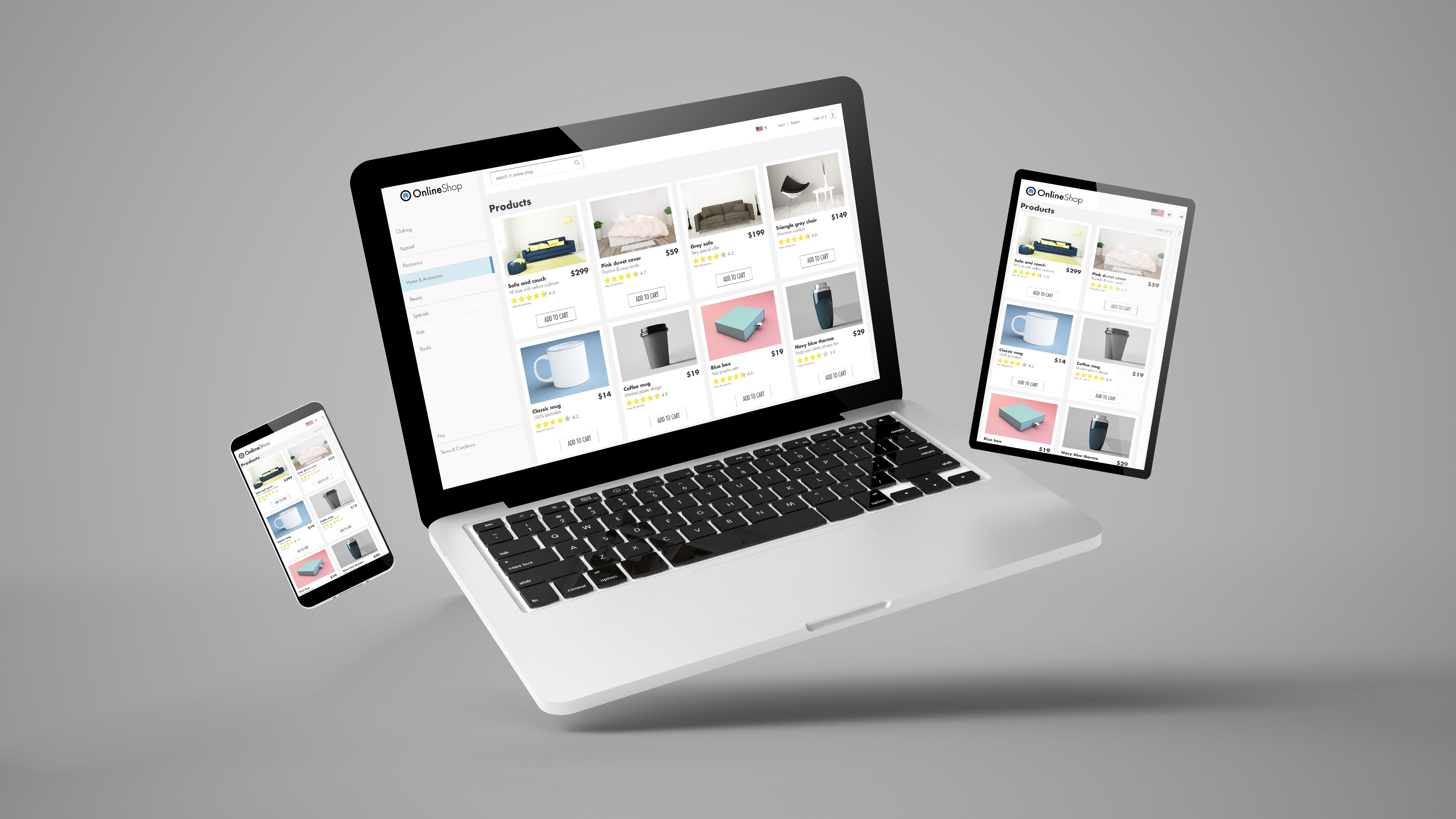
In today's fast-paced digital world, having a website that adapts to various devices is crucial. Responsive web design ensures that your website looks great and functions well on all screen sizes, from desktop computers to smartphones. For Sterling Heights businesses, this adaptability is not just an advantage—it's a necessity.
Responsive design involves using flexible layouts, images, and a fluid grid. This approach allows your website to automatically adjust to the user's device, providing an optimal viewing experience. It enhances usability, improves customer satisfaction, and can significantly impact your business's online presence.

Why Businesses Need It
A bustling city with diverse businesses, requires websites that cater to a wide audience. With more people accessing the internet via mobile devices than ever before, a responsive website is key to reaching potential customers effectively. Businesses that invest in responsive design are more likely to engage users and convert them into loyal customers.
Moreover, search engines like Google prioritize mobile-friendly websites in their rankings. This means that having a responsive website can boost your visibility in search results, driving more traffic to your business.

Benefits of Responsive Web Design
There are several benefits to implementing responsive web design for your business:
- Improved User Experience: A seamless browsing experience increases the likelihood of user engagement and conversion.
- Cost Efficiency: Maintaining a single website that adapts to all devices is more economical than creating separate sites for different platforms.
- Increased Reach: A responsive design ensures that your site can be accessed by anyone, anywhere, on any device.
How to Implement Responsive Design
Implementing responsive web design involves several key steps:
- Use a flexible grid layout to ensure content scales appropriately across devices.
- Incorporate responsive images that adjust to different screen sizes without losing quality.
- Employ media queries in your CSS to apply specific styles for various device characteristics and orientations.
Choosing the Right Partner
To effectively implement responsive web design, partnering with a skilled web design agency can make all the difference. Look for an agency with a proven track record in creating mobile-friendly websites and a clear understanding of your business goals.
Local agencies in Sterling Heights are well-acquainted with the market and can provide tailored solutions that resonate with your target audience. Investing in professional expertise ensures your website not only looks good but also performs optimally.

Final Thoughts
Responsive web design is no longer optional for businesses in Sterling Heights. It is an essential strategy that enhances user experience, boosts search engine rankings, and increases overall business success. By embracing responsive design, you ensure that your website serves as a powerful tool in your marketing arsenal.
As the digital landscape continues to evolve, staying ahead with a responsive, user-friendly website will keep your business competitive and relevant. Don't wait—make the shift to responsive web design today and watch your business thrive.